Form follows power.
We build state-of-the-art web architectures representing pure conversion authority. Clean spacing, supreme typography, and bulletproof responsive performance.
Peter Oyetunji Designer Portfolio
Designer portfolios typically fall into two traps: either they're a bland image dump with no narrative, or they're so visually loud they bury the work. Peter Oyetunji needed a site that expressed his core thesis — design with purpose, not just pixels — and converted visitors into clients without feeling generic.
Built a high-energy, conversion-focused personal portfolio that opens with a direct challenge ("Your brand looks average. Let's fix that."), flows through clear service categories, and closes with a confident call to action — structured to turn passive browsers into booked discovery calls.

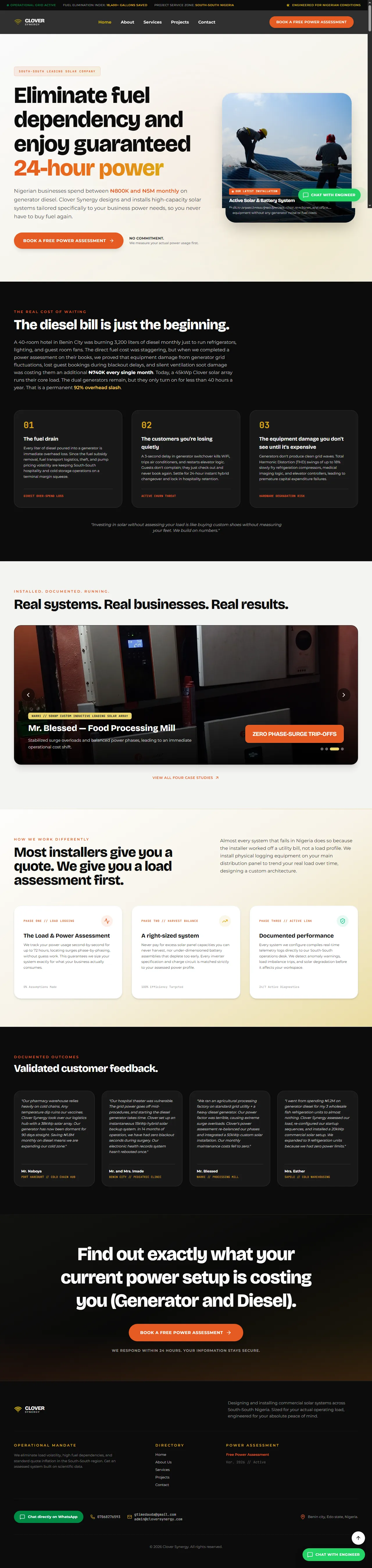
Clover Synergy Clean-Power Platform
The clean-power market is full of vague promises and identical "solar installer" pitches. Clover Synergy needed a site that immediately answers the only question a fuel-weary buyer cares about — "will this actually give me uninterrupted power, and what will it cost me?" — without drowning them in technical noise.
Engineered a conversion-first layout that leads with the 24-hour power guarantee, frames the true cost of diesel dependency, and walks visitors through a free load-assessment offer. Real customer proof, modular system breakdowns, and a single clear "get my power setup costing" call to action remove friction at every scroll.
Cadmilus Express Logistics Platform
The international courier space is crowded with generic "we deliver" messaging that fails to differentiate or build confidence. Cadmilus Express needed a digital presence that immediately projected operational credibility and made the complexity of global shipping feel simple and accessible.
Designed and built a clean, conversion-focused logistics platform that leads with reliability signals, clear service breakdowns, and a frictionless enquiry flow — positioning Cadmilus as the dependable partner for businesses and individuals shipping across borders.

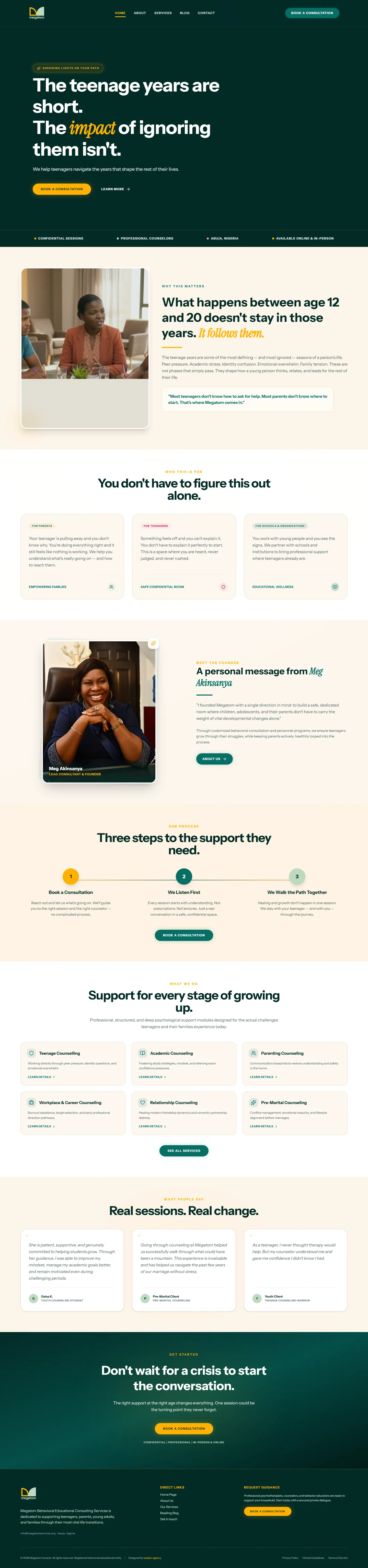
Megatom Consult Teen Support Platform
Parents of teenagers often wait for a crisis before seeking support, missing the most impactful window for early guidance. Megatom Consult needed a digital presence that spoke directly to this urgency and made booking a first session feel natural, safe, and necessary — not reactive.
Designed a reassuring, emotionally intelligent platform that reframes the teenage years as a time of opportunity rather than crisis. The layout is structured around a clear three-step path to support and a compelling call to action that meets parents exactly where they are — before things escalate.
Explore live-rendered interactive previews of our earlier flagship builds.
A digital flagship for a heritage apparel house.
Luxury brands cannot rely on standard template Shopify frameworks. Aura Luxe needed a system that communicates raw haute-couture texture and elite authority while maintaining instant checkout conversions.
Designed and coded a minimal, typographic WebGL-enhanced system incorporating immersive scroll grids, premium letter-spacing transitions, and zero friction, high-trust payment paths.
Engineering trust for cross-border funding.
High-net-worth investors make decisions in under 12 seconds. Vertex needed a strategic interface that immediately answers: market proof, current capital deployment, and rapid access gates.
Implemented a responsive lead-onboarding landing structure using cinematic light overlays, raw copy architectures, interactive asset-allocation calculators, and rapid-response document locks.
Amplifying artistic authority.
Traditional agency portfolios are dry and look corporate. Soma required an immersive playground highlighting cinematic art installations and audio clips without causing render lag or complex navigation paths.
Created an ultra-minimal Swiss layout using extreme typography scale, high-contrast black-and-white visual themes, and inline audio canvas rendering running on low CPU devices.
Make your brand as valuable as the business behind it.
Book a free Brand Growth Audit and find out exactly where your positioning, perception, or conversion process is leaking trust.Audit your brand. Find the gaps. Fix the system.